A Family Memory in Woodcut
- Frank & Sylvie

- Jan 17
- 5 min read
Some images impose themselves naturally. Not because they are spectacular, but because they carry within them a story that extends far beyond the moment they are created. The woodcut presented here is one of them.
It all began with a photograph taken in my cousin Olivier’s garage. It shows a pre-war Citroën, very close to the model my grandfather once owned. Olivier restored one with remarkable care, and when I saw it there, illuminated by the artificial light of the garage, I immediately knew that this image would one day become something more than just a photograph.

Beyond the family story, this vehicle belongs to a period—the early 20th century—that naturally resonates with the Art Nouveau universe we have developed in the gîte. I wanted to draw from it freely, thinking more about the posters of that era than their ornamental details: readable forms, a dynamic composition, an image designed to be seen from a distance.
From the outset, the intention was clear: to depict the car at night, moving through a street lit by lampposts, conveying that sense of motion, solitude, and focus one can feel when driving in the dark.

The Setting of the Workshop: Learning in a Suspended Moment
The woodcut was created during a workshop held over four evenings at the Volkshochschule in Hanau, Germany, led by Joachim Mennicken. What struck me immediately was the very simple yet deeply human atmosphere that emerged from the very first session.
The group was made up of very different profiles: young participants, retirees, a couple whose woman, three months pregnant, was working next to me on a whale inspired by Japanese motifs, emerging from a rough sea, while her partner composed a patchwork of shapes and textures. Across from me, an older woman was patiently creating a self-portrait. Another retired couple included an American husband carving a dog in an almost comic-book style.
Joachim guided the workshop with great calm. With his slightly greying, somewhat tousled hair and an unfailingly optimistic demeanor, he moved from one person to another, adjusting a gesture, suggesting a solution, offering encouragement. A few cakes had been placed on the table, and soft jazz music played in the background. Very quickly, the concerns of the workday faded away completely. Everyone focused on their subject, on the wood beneath their fingers, on slow and attentive movements, all while sharing an awareness of the need to avoid injury when working with the carving tools.
From Drawing to the Block: Thinking the Image in Reverse
The technique used here is woodcut in relief printing, more specifically reduction woodcut, sometimes referred to as the “lost block” method. A single block is used to print all colours, but it is carved a little further at each stage. What is removed is lost forever, which means the final image must be anticipated from the very beginning.
For woodcut printing, soft and homogeneous woods are generally preferred, such as linden (basswood)—highly regular and precise—pearwood or maple, which allow for finer details but require greater effort and control. Poplar, although easy to source, often has an irregular grain and tends to splinter when cut across the fibres, limiting line clarity and precision. I could have chosen linoleum, which is easier and more predictable to carve, but wood offers something else: its grain, marbling and small irregularities become part of the image and reveal themselves in the print as a living material—something impossible to achieve with a perfectly uniform surface.
After the preparatory drawing, selected areas were transferred onto the block using carbon paper, starting with the parts intended to remain the lightest in the final print.

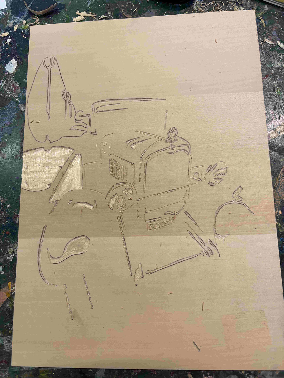
The areas intended to remain white were carved out first. The wood is removed slowly, without aiming for mechanical perfection—the gesture itself already leaves its mark.
In woodcut printing, fewer tools are often better, provided they are well chosen: one or two V-shaped gouges for cutting lines, a few U-shaped gouges for clearing larger areas, all kept perfectly sharp to maintain control and avoid slipping.
To work safely and retain control, I place the tool in the palm of my hand, guided by the index finger, while the thumb of my left hand acts as a brake and guide for the movement of my right hand, reducing the risk of unwanted slipping.

Printing, Washing, Carving Again: A Layered Construction
In my case, the first print corresponds to the greys, which structure the scene and its volumes.

Once the print is made, the block is washed with water and dried, then new areas are transferred and carved—those intended to remain grey. The next step is the salmon colour, used for the body of the car.

The printing was done using water-based typographic inks, which are easy to clean and pleasant to work with in the studio, while still offering good colour intensity when applied carefully.


At each stage, the block becomes more reduced, while the image gains depth. The process grows increasingly irreversible, demanding great concentration.

After carving the reddish areas of the car, the first strong contrast appears with the blue print.

After cleaning, all blue areas must be carved away, leaving only those that will be printed in black.

Accident as a Living Element
The final print, in black, is always a special moment. It is where the image almost fully reveals itself.

Some details deserve special attention. The car’s radiator grille, for example, is constructed through a series of parallel lines cut with a knife, forming a deliberately graphic pattern that recalls the visual language of early posters.
The accidental textures visible in the grey areas—small irregularities, marks, variations—are caused by traces of ink remaining in certain carved areas. They are neither corrected nor concealed. On the contrary, they are an integral part of the final result.
This is what makes each print slightly different, despite using the same block and the same process. Woodcut printing is never perfectly reproducible, and it is precisely this element of unpredictability that gives it its richness.

A Counterpoint: Roots and Variations
My wife took part in the same workshop, but with a very different approach. Her print depicts imaginary roots, produced from a single block and explored through varying pressure and colour.

Here again, each print is unique, a variation on the same motif. This dialogue between two approaches—figurative and narrative on the one hand, more organic and experimental on the other—reflects quite well the way we inhabit and think about the gîte.

Waiting for Their Place
The prints are not yet hung. They are waiting for their frames, their wall, their dialogue with the space. Soon they will find their place in one or two rooms, extending this story shaped by slow gestures, memory, and material.

For now, they are still on their way. Like the car itself, moving through the night, lit by a few street lamps.


Comments